MY WORK ISN’T FOR EVERYONE.
I work directly with business owners and decision-makers who build real products and care how they’re made. Manufacturing, custom fabrication, automotive, drums, and the outdoors aren’t niches to me—they’re the world I come from.
If you make something REAL and expect your brand to carry the same weight as the work itself, we’ll get along just fine. If you’re looking for decoration, trends, or committee-driven design, this probably isn’t a fit.
I’m a hired gun—secret weapon, however you want to put it. With 27+ years across big agencies and my own design shop, I bring senior-level thinking with hands-on execution. I don’t hand things off. I stay close to the work.
My understanding of manufacturing started early, working alongside my dad in his hot rod business, and deepened later as a part owner of a custom furniture company for seven years, where I handled all design and shared directly in the manufacturing process. I know how things are built, where corners get cut, and why details are everything.
Every client I work with builds something they are proud of building - so much so they put their name on it. I understand the products I help brand because I’ve lived on both sides of the line: design and production. This is the sweet spot for me.
My work spans branding, fabrication, design, art direction, and creative direction, with deep experience in illustration and publication design. I dig in, ask hard questions, and make sure the creative earns its place—accurate, intentional, and built to last. I’m not happy until my client is.
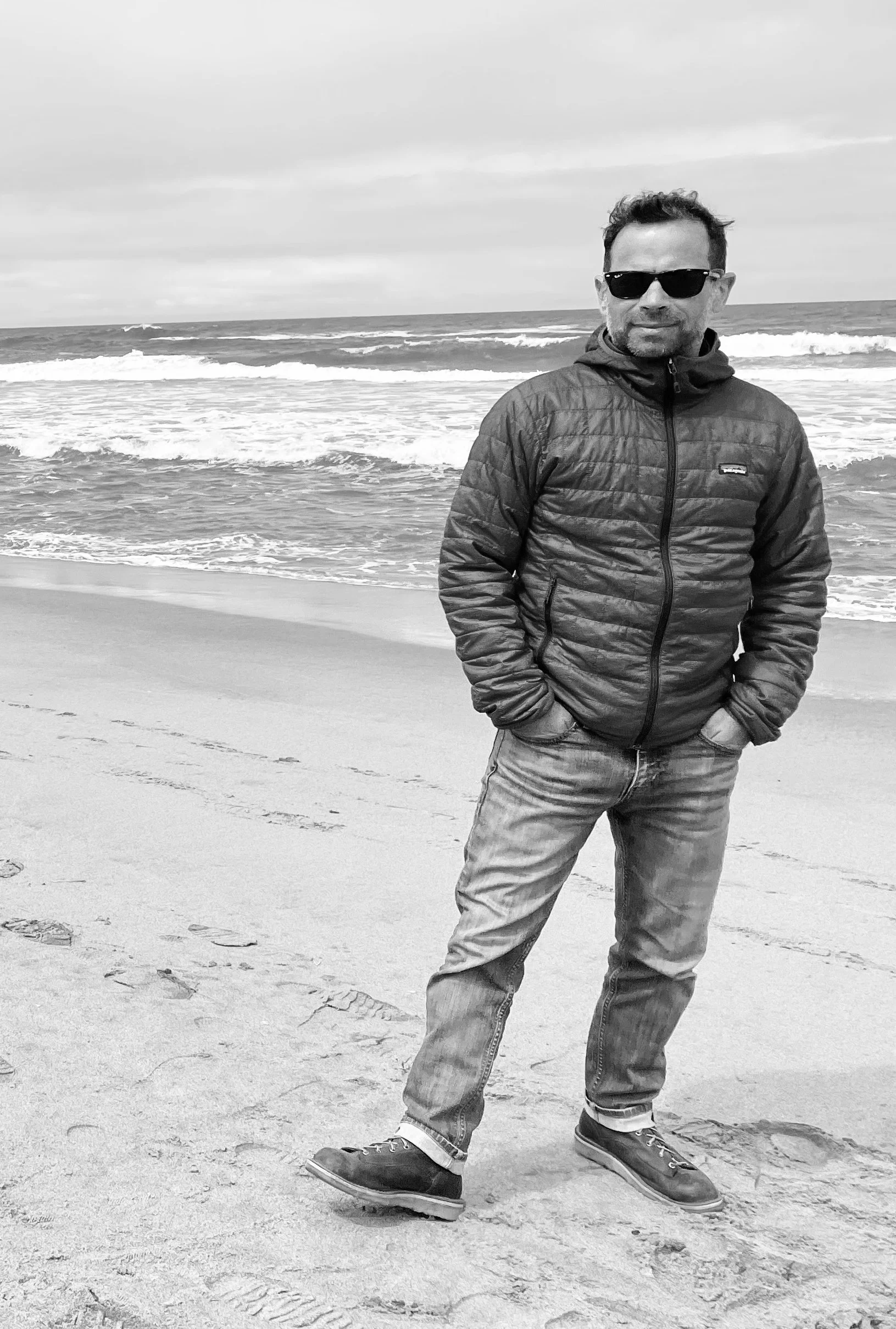
When I’m not working, I’m usually on two wheels in Oregon’s high desert, hiking somewhere off the map, or behind a set of drums.
If this sounds like how you work, let’s talk.